Hey everyone. I’m trying out a new format. It’s probably not going to be the long-term solution, but it fixes some short term issues.
- Contrast – readability.
- Code listing – character disambiguation.
Contrast
Some of us, as we get older, start having trouble with contrast; others have lifelong issues. As much as I liked the grey on off-white format, I started seeing issues myself, then an old buddy (known him for 20 years, and he’s older than me) called me out on readability.
The new color scheme is not perfect, it will probably iterate some more, but at the subscription level I have a WordPress, fine-tuning does not seem to be an option.
I like the new colors as a DOS/Win 3.x nostalgia trip. After amber and green VT100’s, the blue and white or blue and yellow scheme was one of my preferred at that time.
Font
Font choice allows creative expression. You can immediately set the tone of a piece with some judicious choices. There are fonts that give a handwritten style, cursive or block, to add a personal touch. There are cuddly round fonts for humour. Courier and Times set a clean look and professional tone.
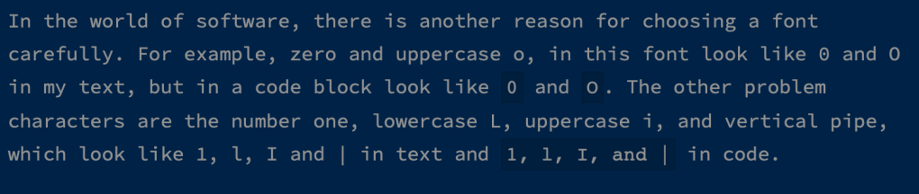
In the world of software, there is another reason for choosing a font carefully. For example, zero and uppercase o, in this font look like 0 and O in my text, but in a code block look like 0 and O. The other problem characters are the number one, lowercase L, uppercase i, and vertical pipe, which look like 1, l, I and | in text and 1, l, I, and | in code. Of course, I set the code and text font’s on WordPress by changing a “theme” for the site. Those reading this post today will see the current fonts. I changed the theme a few months ago, and I know I will refine again later.
To show you this volatility, here is a “preview” of the post, versus what the editor is showing.
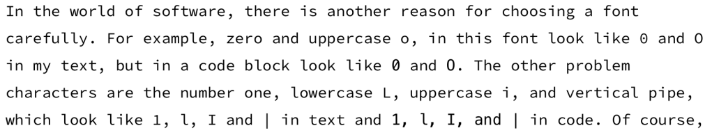
You can see that the zero and o are more distinct in the WYSIWYG view than in the final version. The other characters are distinct in both views, just different. I need to learn more about CSS and WordPress to fix this. I really want the ancient font “Hell’s Programmer,” but Consolas would work too.
Call for feedback
The new format has been up for a couple of months, and so far no complaints. Any feedback is valued. I want this blog to work for everyone.
