I don’t often need to draw timing diagrams, but occasionally I do. It’s not an everyday task. When discussing a bug, I find it easiest to share a captured trace from the scope. When trying to describe what an expected signal should be, I turn to the whiteboard or a piece of paper. There are, however, times in my life when I am trying to specify how a new hardware block should work; this requires a clean, easy-to-edit diagram to share.
There are many drawing tools available. For years, my go-to tool was Visio, but working with Confluence over the last few years, I’ve been using draw.io. They are competent tools for putting together block diagrams, data flow diagrams, and state diagrams.
They suck at drawing waveforms, with a lot of careful copying and pasting needed. Snap-to-grid either helps or hinders at different zoom levels. I finally found a better solution! Some tools turn text into diagrams; I can now code up a wave diagram.
Quick aside before you scroll on:
This page gets a lot of traffic, but I rarely hear whether it actually helps. Is there enough information here or do you need more?
✉️ Send feedback or
💬 use the anonymous form — both are welcome, and neither adds you to anything.
Text-to-diagram tools
I was introduced to the text-to-sequence diagram tool WebSequenceDiagrams about ten years ago, and loved it. I later found PlantText, which added other types of diagram that I could just type in, with the rendering mostly staying balanced on screen. I knew something had to be able to make my timing diagrams. Turns out I was right. The tool I found was WaveDrom. Checking more recently. I also found that PlantText can also do this.
The PlantText or PlantUML solution is quite rich, and from what I can see is a more rounded tool for putting a whole system on a timeline, but when it comes to roughing out a bus, I think that WaveDrom has an edge.
As a trial I put together a couple of quick diagrams of the start of an I2C transaction. I spent about 15 minutes on each. I have used both tools before, but not recently.

Note: Due to WordPress's SVG upload limitation, the WaveDrom diagram is in PNG format, which might appear less sharp compared to the SVG-rendered PlantText. For a clearer view, visit this link.
Usability
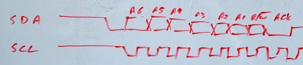
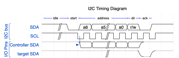
Looking at the SDA signal in the above diagrams, the bit value during addressing depends upon the actual address. WaveDrom allows the “either high or low” state as well as the explicit highs and lows. You can show a transition at each falling clock edge as the value is permitted to change . In PlantText you can set the signal to be {low, high} but even if you do that on each clock, the signal stays in that pattern of vertical bars. It’s less obvious that the state is changing at clock boundaries. I added a UML “concise” signal alongside the binary to show what the SDA is representing. It start to make the diagram a little less clear, but it did give me the chance to label things like
I found that WaveDrom allowed me to easily insert break in the timeline. I also found that WaveDrom allowed me to easily add a high-z state (not shown) or pull up resistance, as seen here showing the open drain drive of the pulled up SDA lines. I should note that SCL is also open drain, and I did want to show the clock stretching, but the clocking is a negative pulse, and I did not see an easy way to depict a clock that went between pull up and ground.
Looking at the code
PlantUML/PlantText
Now, how easy are these to code? Plant UML was verbose, and needed a lot of repetitive typing or copy and paste. I did have greater control of where I placed edges. You pick a time stamp for the edge, such as @2.75 and you can work in whatever units you like, here I was in ticks. I could have specified a free running clock, but for I2C I wanted a gated clock that only ran in burst of 10 bit cycles. Overall, I think I had more control of the diagram, but it was not suiting my purposes.
@startuml
title I2C Timing Diagram

binary "SDA" as SDA
concise "SDA" as data
binary "SCL" as SCL
highlight  -3 to 0 : idle
highlight  0 to 1 : start
highlight  1 to 8 : address
highlight  8 to 9 : dir
highlight  9 to 10 : ack
highlight 10 to 11 : data

@-3
SCL is high
SDA is high
data is "pullup"
@-0.5
SDA is low
data is "start"

@1
SCL is low
SDA is {low,high}
data is "A6"
@1.5
SCL is high
@2
SCL is low
data is "A5"
@2.5
SCL is high
@3
SCL is low
data is "A4"
@3.5
SCL is high
@4
SCL is low
data is "A3"
@4.5
SCL is high
@5
SCL is low
data is "A2"
@5.5
SCL is high
@6
SCL is low
data is "A1"
@6.5
SCL is high
@7
SCL is low
data is "A0"
@7.5
SCL is high
@8
SCL is low
data is "R/W#"
@8.5
SCL is high
@9
SCL is low
SDA is low
data is "ACK"
@9.5
SCL is high
@10
data is "D7"
@enduml
WaveDrom
WaveDrom uses a much terser format, and you can almost see the output in the raw text. The period simply repeats the previous state. The other tokens are quite simple.
=means “high or low” or can have a data value associateduanddare pull-up/down,zis tri-state (high-z, high impedance)h,lare high and low electrical levels0and1are the logic states.
The only equivalent logic level in PlantUML is the binary type, which can be a low, 0, high or 1.
{
  head:{text:'I2C Timing Diagram'},
  foot:{tock:-3},
  signal: [
    {node:'A.BCD.....EFGH', },
    {name: 'sda', wave: 'h|0========01',
     data:'a6 a5 a4 a3 a2 a1 a0 r/w '},
    {name: 'scl',   wave: 'h|.n........h'},
  ],
    edge: ['A+B idle','B+C start','C+E address','E+F dir','F+G ack'],
  config: {hscale:1}
}
Summing up
I have barely scratched the surface of both tools. I have a feeling that WaveDrom will suit 80% of my needs, and PlantText will give me the balance. Still, my frequency of need is so small that both of these free tools provide all that I need. I’m not ready to recommend one over the other; I just wanted to bring them both to your attention as I find them very useful. I will use PlantText when I want more precision on timing and have a sparse diagram. It seems to lean towards software related timing issues. I will lean more on WaveDrom for simplified diagrams that don’t require precise timing; Especially when I’m more focussed on a board trace between IO pins of devices.

UPDATE: New supporting GitHub Repo
I have just created a repo to support this blog. In particular, I have added an example Wavedrom diagram.
The repo contains the original JSON for the diagram, a link to an interactive editor, and a short description of the scenario illustrated.
The repo is “brand new” as of today, so the resources are limited.
https://github.com/aodonnell-ca/glorified-plumbing-public/tree/main/wavedrom
LikeLike
STOP PRESS:
I just learnt about Timing Designer from EMA. While it does allow you to draw diagrams, it seems that is only one facet of the software. From the brief video on their welcome page, it seems that Timing Desgner is also a simulation/analysis tool to be used by FPGA and ASIC designers.
It seems you define your timing specifications in a spreadsheet and this provides a reference model for your simulator. Timing violations will are reported so the design can be corrected before taping out.
It seems that the overall package is much more than I need for simple documentation, especially when simply trying to outline bugs or gathering my thoughts for firmware implementation. Maybe when I get back to FPGA work it will make more sense.
LikeLike