What you see is what you get.
A Helpful Tool
There is a helpful type of text editing tool known as a WYSIWYG editor. They have been around so long that most of us don’t know that we used to do things in other ways.
Microsoft Word is a great example. You type in text, and it shows on-screen, just like any editor. Now for the fun parts. You change the font, and unless you’re moving between fixed point fonts, all the words become a different length, and maybe some words get so much shorter that you get one more word on a line, and all the text shifts. You actually see the text as it would appear on the printed page (or rendered PDF).
It’s not just adjusting font shape and text wrapping that you see immediate changes. Boldface, italics, indent, adjusted margins, line spacing, kerning, etc. WYSIWYG is very powerful.
My Early Forays Into WYSIWYG.
Years ago (the mid-1990s), I was programming a GUI (graphical user interface) for a Mac (Quadra and Centris families, 68K based). The tool I was using to write C code for System 7 was Think C. For dialog boxes on-screen, I had to type in the dimensions I needed and offsets for buttons, text boxes, and text within the dialog box. I had to then compile and run the code to see if I had got what I wanted.
Soon after my early Mac adventures, I wrote a desktop application for a PC; it was a demonstration tool to drive our hardware. I had the advantage of being able to use Visual Basic. VB, as its commonly known, was a WYSIWYG tool for creating on-screen assets, such as dialog boxes. I could use the graphical tool to compose my windows. I could then bind these elements to my code – VB had created template code for button actions and data entry fields, I just bring my value add.
Eventually, I had a chance to make a personal web-page. I had a free copy of Adobe Page Mill that came with a printer. I didn’t need to know HTML to create a page; I just needed to have a reasonable talent for layout, some art (photos and scanned drawings), and text that I’d written. Page Mill let me compose my website; the tool managed the HTML and provided widgets to help me to add links, images, and text blocks. In those days it felt like a type of magic.
Not Without Its Problems.
So, I have been using WYSIWYG editors for long enough to know how good a job they can do. I also know that there are a couple of pitfalls.
- Reliance on system resources
- Fonts – if the font is not found, substitutions are made for you.
- Screen size – Aspect ratio of screens can cause issues with full screen apps/presentations.
- Sub-optimal performance
- Cruft – artifacts left behind during the editing phase; PageMill was a big offender in its early days. I still see this in some word processors, style tags left around a space when a few highlighted words were deleted, etc.
- Standardized widgets – utilities that provide commonly required functionality; Visual Basic allows rapid development of GUI applications by using these tools. The widgets offer a superset of what is actually needed. Using a “one size fits all” approach, they used to add bloat to the generated code.
There are more, but what I want to address today is a problem that is probably buried deep in some nested CSS style sheets. To be honest, I spend my brain energy on engineering embedded systems or sharing my experiences of engineering here in my blog. I don’t spend much time on fancy formatting and have not spent any time learning HTML since 2000. I have learned markdown and LaTeX to help with documentation in Git code repositories and assorted work-related wikis.
One Size Fits Most.
I chose a popular platform to host my blog, WordPress. I used to compose the articles in markdown, within a Git repo, then use the WordPress browser-based WYSIWYG editor to make the article presentable. I now compose directly in the WordPress editor.
WordPress comes with pre-built themes. I have selected a fairly clean and simple theme. I liked the fonts, the highlighting, the palette, and the layout. Everything should be perfect.
With my first posts, I used to read the finished page, as you see it, to make sure all was good. It never seemed to differ from the preview copies I see in the editor. Last week I had a surprise.
My recent post about a software bug needed code samples, and I also wanted to show console output. There is a block for code. I wasn’t happy with how it showed up, so I used the sidebar tool to change two things – background color and font color. For code, I used a blue theme and for the console, why not use a VT100-like amber screen?
Looking at the WYSIWYG on the left, and the final version on the right, you see things didn’t work out all that well.
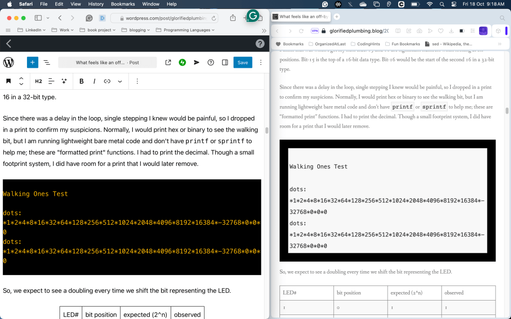
I checked just now, and yes, I missed the Preview tool in my final review. The preview would have shown me what I was really going to get.
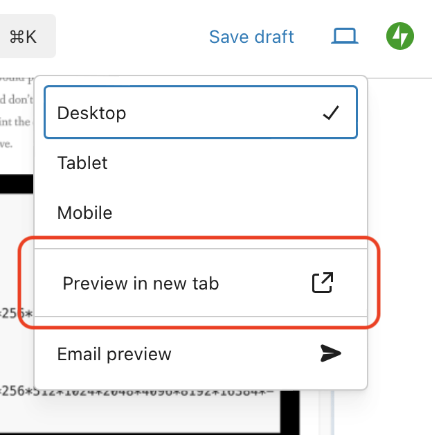
In my early experience with WordPress, I found the Preview allowed me to see the post content within the context of the web page rather than alongside the edit tools. I hadn’t really seen the style differences, I played initially with text only. The critical question is how this will appear on tablets and phones, which is not “Preview in new tab”.
When I changed the style of the quoted block and code block, I saw the effect immediately within the editor, but not on the final page. I got what I wanted.
Themes and Local Styles, a Unified Experience.
For the final rendering on the web, there must be a parent style that overrides local changes within a post. If I knew more than a smattering of webpage design, I would understand how this really works. I know I can have a default style, and I can have a local style. I also believe you can have an overall theme for a site or page within a site.
Having an overall setting is very useful for a site; a consistent style leads to a polished, professional look. There is nothing more distracting than having the design language constantly changing within a product. Have you noticed how jarring it is to go between Android Auto, Car Player, and the car stereo’s native display?
I don’t know which TV streaming device you have, but Roku has a specific look and feel at the top layer. However, when you go into the app for your service of choice, it no longer follows the Roku style. This is counter to how life is under macOS, Windows, and Linux. Within each operating system is a consistent layout for menu placement, look and feel of pop-ups, window size buttons, and which side of a tab is the x to close.
I have Prime Video, Netflix, and Hulu apps on my Roku at the moment. The interfaces are coalescing on a shared style but have been radically different from each other over the years. Still, confusion and frustration arise from this. Does the “skip back” button cause a rewind 10 seconds or 30? Does the FFWD button cause a show selection menu to page left, or have no action at all? Is the closed caption set by an app on-screen widget, or do I have to use the Roku CC options?
The other TV is a Samsung, and at times, the streaming service apps between the two differ; maybe they rolled out a change to the Samsung a month ahead of deploying the Roku version, or perhaps they are just taking advantage of a different remote control layout. The framework provided by Samsung probably does not have the same features as the Roku. Such a foundational library will provide the base operations of TV control, video transcoding, and network connection, but the value-add from the service’s app is how to manage watchlists, preferences for language and captions, and whether or not playback speed controls exist.
Don’t get me started on mobile apps!
A blog is a product, just like your set-top box or car stereo head unit. It should present an even user look and feel. Nothing should feel like it came from elsewhere, and not belong.
What Is My Problem?
I think I understand why my styling never happened, or rather, why my WYSIWYG got overwritten.
If I write content, it should contain essential formatting, such as what type of block it is. It shouldn’t really contain specific formatting about how a block is styled “on this page.” What would happen if I changed my theme one day? The Theme is the overall site style. If I change the theme, every page’s look will change in unison.
I opted for one of the simple ones from the WordPress library. Over the last year, I have found I wanted to tweak a few blocks. If I have too much customization in my posts, things will look very messy when I do change the theme. The problems may be as simple as a list block in a strange font, or they could be as nasty as clashing palettes and colors that look ugly together. I might even find places where changing to a light grey background renders the light gray text illegible.
I had come to trust the editor too much; forgetting about the cascading styles and dominant theme, I stopped doing the final preview. Can you imagine writing code and not performing basic QA (quality assurance) tests on it? That’s what I’ve been doing to you for the last few months! I’m sorry.
I Want to Blame WordPress.
I want to blame WordPress for not applying my style sheet to their editor’s live view. I feel like the interactive change to the view of my code blocks led me to a false sense of security. It did, undeniably. However, if my theme had been applied, then I would be leading myself into trouble still. If I were to re-use the content in another forum, the changes I saw from my theme would not be carried over. I have actually posted draft chapters of my book on this blog. The book’s format is very different from the blogs, so I really do need minimal tuning on each page so that I can move content between platforms.
WordPress has done, arguably, the right thing. They allowed me to compose within my account, and if I decide to publish elsewhere, then what they helped me create will be portable. From the Wikipedia article on WYSIWYG, there are a few alternate forms:
- WYSIAWYG; what you see is almost what you get, similar to WYSIMOLWYG
- WYSIMOLWYG, what you see is more or less what you get, recognizing that most WYSIWYG implementations are imperfect.
- WYSIWYW, what you see is what you want, used to describe GNU TeXmacs editing platform.[22] The abbreviation clarifies that unlike in WYSIWYG editors, the user is able to customize WYSIWYW platforms to act (possibly in part) as manual typesetting programs such as TeXor troff.
Fixing It All.
I have some homework to do. I have obviously picked the wrong theme. Through naive trust in the tools, I have made a bit of a mess. I keep forgetting that I don’t write simple lifestyle blogs, though I believe engineering to be a lifestyle. I need special formatting for code, keywords, and console output. I need a font where zero 0 and the letter O are distinct. ( I did have a low-end typewriter that had no zero key, relying on capital O.) Likewise, lowercase l, capital I, and the number 1 have to be different. I even care about the vertical pipe character | as that shows up in code, too.
I want hyperlinks to be very traditional, in blue text with an underscore, so it’s clear that they are links.
I have a few of ways forward:
- find the perfect theme from the library.
- learn HTML, CSS, and any other language to do my own.
- work with an expert to get what I need.
There are pros and cons to each. I’ll have to balance time, cost, and return on my investment. An improvement in format should help with readability and, therefore, audience retention.
You Too Can Have a Website!
I’m not criticizing WordPress. I have been enjoying the ease of use and richness of the tools. I do, however, just want to raise the awareness flag.
PageMill, as I mentioned earlier, got me static web pages very easily, and I could quickly build a site using embedded tools that helped me link between .html files on my site using a simple file system browser.
Adding APIs and dynamic content was not something PageMill was designed to do. I think I could create a blog with that tool, but I’d have to update index pages as well as create the posts.
It also occasionally bloated the HTML as sometimes formatting changes became nested. I found some HTML where I had added bold but then changed to italics, and the tags for bold, end bold, italics, end italics, bold, and end bold all appeared in the sequence.
“`
My notable word is italicized!
“`
It didn’t always happen. I’m not sure if I’d made it bold, made italics-bold, then cleared the bold format, or followed some other workflow; I just know I saw it when reading the generated HTML to learn how to write it. I remember a buddy who did HTML warning me of such potential errors and other similar inefficiencies.
I had trouble with an early VB project, too. I got 90% of the code done but had trouble with one edit box. I was using the standard component, which didn’t update the way I needed it to with an incoming data stream. We had a VB expert in-house, and they pointed me to an alternate widget.
All these examples, including my oh-oh with WordPress, show how a lot of us can do great things with the WYSIWYG tools, but at some point, the tool “fails us.” We ask for “just one more thing,” which happens to be the “straw that breaks the camel’s back.” The next step forward needs expertise that we would have gained if we had always built from the ground up. The question today is, “Do I adjust my expectations, or do I change my role from mere author of the content to web designer?”
The WYSIWYG tools have always democratized the creative processes. Word (actually, for me, it was Claris Works initially) allowed me to format my pages and change my fonts, cutting out the need for a typesetter. PageMill allowed me to make web pages without knowing HTML. VB saved me from calculating box heights and widget offsets. It’s all part of automation. I can focus on where my skills are most needed.
If I were paying someone to maintain my website for me, reformating my Word document to HTML format, matching sitewide style, uploading content, and maintaining indexes, it would probably incur 20 billable hours per month. WordPress allows me to do all that for free if I want, but I have a paid “personal” subscription for about $2.50 per month.
Eliminating cost and technical (computer) skill requirements allows everyone to have a voice. The only limitation is where aspiration exceeds the tool’s abilities and not the content creators.

Just my personal observation on this subject matter –
I find the (light) gray font color displayed on a white bg is very difficult for me (a senior) to read.
BTW – I don’t know how to upload a screen shot of this page as it appears in my latest Firefox browser.
LikeLiked by 1 person
Sorry, need to clarify on my previous comment above:
LikeLiked by 1 person
I understand; hence, I am looking for a way to improve things. I am not sure when changes will roll out as blogging is in the realm of “hobbies and interests,” and I have a real job that gives me more screen time than I care for.
I may have to up the game and get a custom design. I’d love to learn how to do this myself, but I may just get a new theme from the WordPress libraries.
LikeLike